Freelance Cartography
Castaway Mountain by Saumya Roy
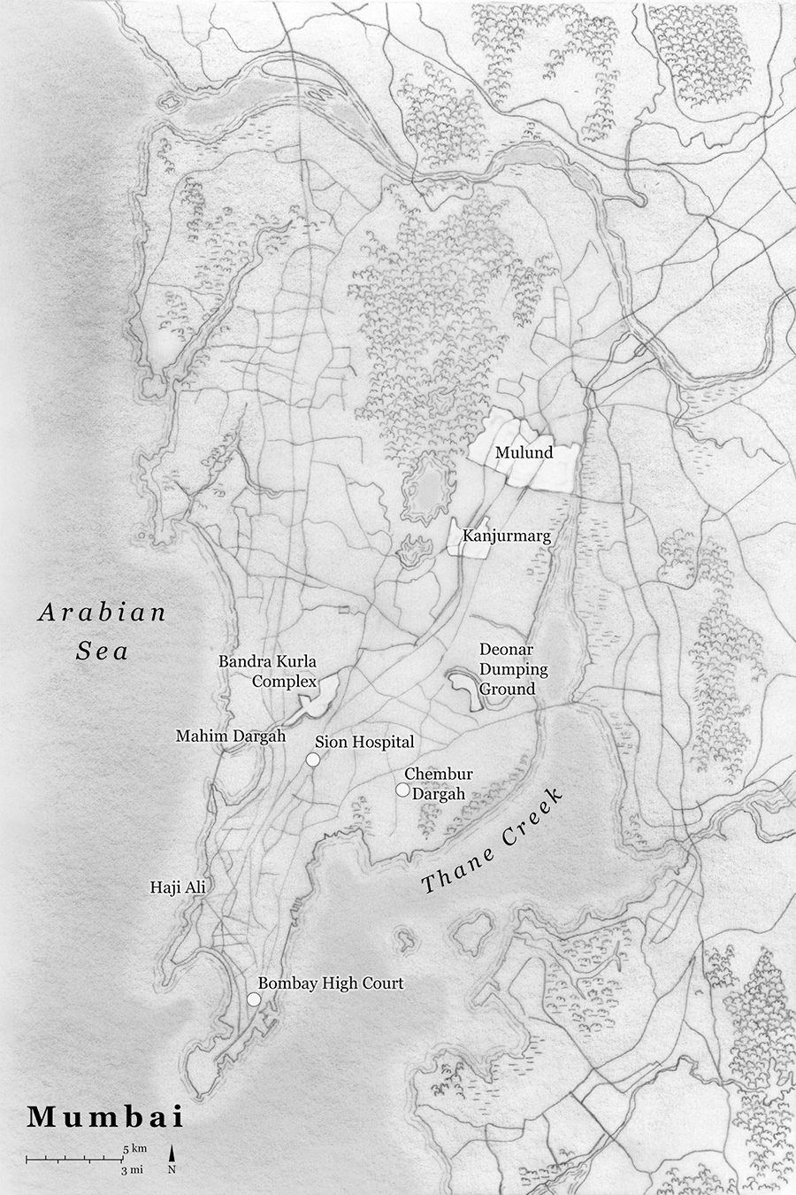
2021. Hand-drawn linework and textures layered in Adobe Photoshop and labeled using Adobe Illustrator
Astra House published Castaway Mountain, Saumya Roy's debut novel, in September 2021. I very much enjoyed returning to the geography of Mumbai while employing a different cartographic style. This was an opportunity to combine my hand-drawn techniques with a compositional structure appropriate for a novel.
Hydraulic City
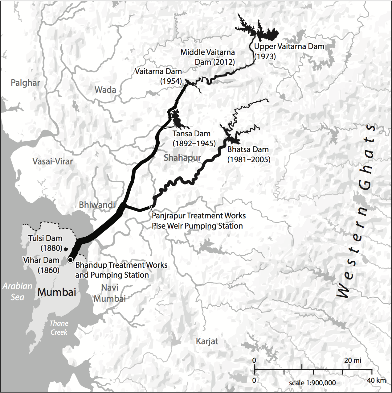
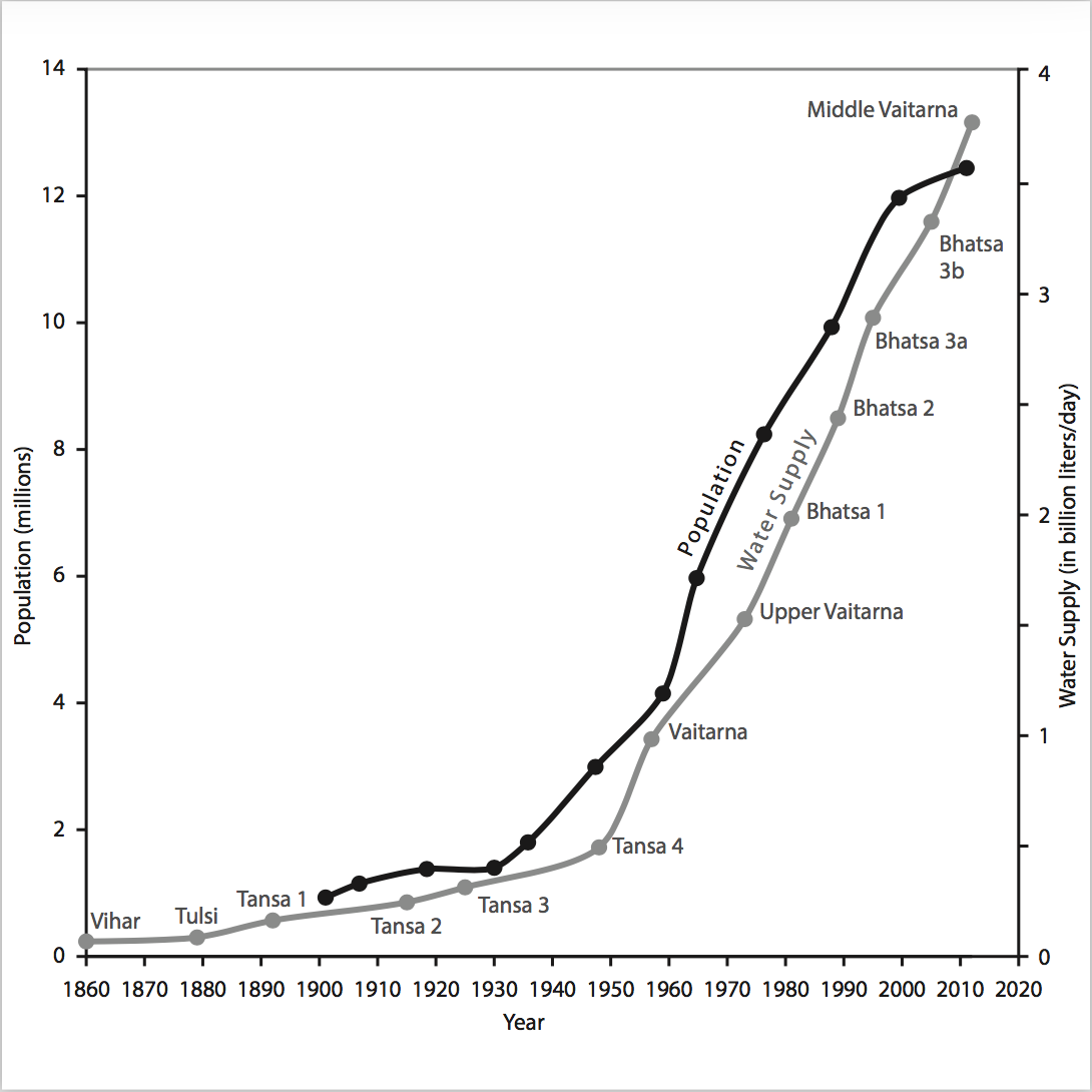
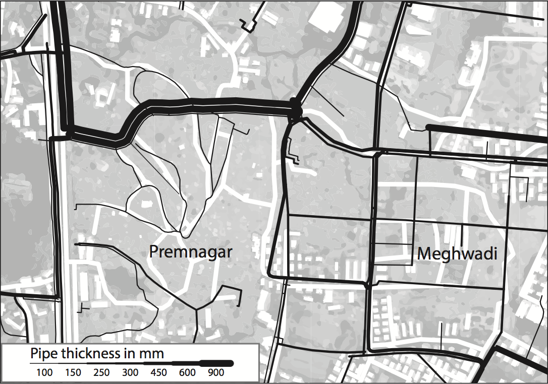
2016. Compiled using QGIS and designed with Adobe Illustrator/Avenza MAPublisher.
I completed these maps and a line graph for Dr. Nikhil Anand and Duke University Press in early 2016; Hydraulic City: Water and the Infrastructures of Citizenship in Mumbai came out a year later in March, 2017. Learn more about the book by visiting DUP's page. Completion required gathering and digitizing data from a variety of sources provided by the author. Similar to previous maps and diagrams I've completed for Duke University Press, I had to develop sound visual hierarchies without the use of color.
i[bike]Oakland Bikeways Map
2010–2019. Initial data compiled using ArcGIS Desktop and designed with Adobe Illustrator, Photoshop, and InDesign. Starting with the 2014 edition, data handled with MAPublisher.
I implemented a major overhaul of the look and feel for the I[bike]Oakland Bikeways map with the 2017 edition. For one, I've learned a few things about cartography since I designed the original 2010 edition while working as a planning intern with the Oakland Bicycle and Pedestrian Facilities Program. In addition, the increasingly filled-in and complex bikeways network and the addition of a new (for Oakland) bikeway type, the protected bike lane, prompted me to reevaulate a host of interrelated map elements.
I changed the primary typeface from Gill Sans to Avenir Next Condensed. My early grad-school infatuation with Gill Sans (and its invocation the iconic London Tube Map) at last gave way under increasing labeling demands. Avenir Next Condensed is not my favorite. Any typeface with "condensed" in its name is probably off to a sub-optimal start as it is, but I found it minimally offensive at first, and it has even grown on me over time. And it is much more practical for my purposes than one of my true favorites, Gotham, which I used in versions 2 and 3 of my fantasy BART map. Even the bike shop/kitchen labels were converted from American Typewriter to American Typewriter Condensed. The street network labels were completely regenerated and placed utilizing the base-level labeling tools in MAPublisher—in other words, hand-tuned without the benefit of LabelPro.
With this edition I'm making much better use of MAPublisher's label haloing tools for reducing visual conflicts between labels and bikeways. My reliance on halos has generally been greatly reduced by the softer palette I've chosen for large filled areas, primarily park areas and open water. Also dropped are the black casings that enclosed the bikeway network in previous editions. Casings are now reserved for protected bikeways, like the newly installed protected bike lane along Telegraph Ave through KONO. Now the important features truly get the most ink. Overall I think the result provides a fresh new look for a map entering its eighth edition, with many thousands of copies freely distributed throughout the East Bay.
Some additional notes on this map: each year we incorporate edits based on the Bicycle and Pedestrian Facilities Program’s success in augmenting the bikeway network during the previous year. I depict the underlying street network and its hierarchy by tapping into OpenStreetMap, utilizing the extracts now hosted by Mapzen. I devised a more sophisticated visual treatment of elevated highways and overpasses with the fourth (2013) edition. Beautifully lithographed, it’s best viewed in print and fits in your pocket (3.5 x 5 inches folded); pick up a free copy at most Oakland bike shops. A PDF version of the 2012 edition is available here. I wrote about the first edition on my blog, check it out and travel back in time to when I was still a grad student/planning intern. In that post I provide pictures of how the finished map looks folded.
A Nervous State by Nancy Rose Hunt
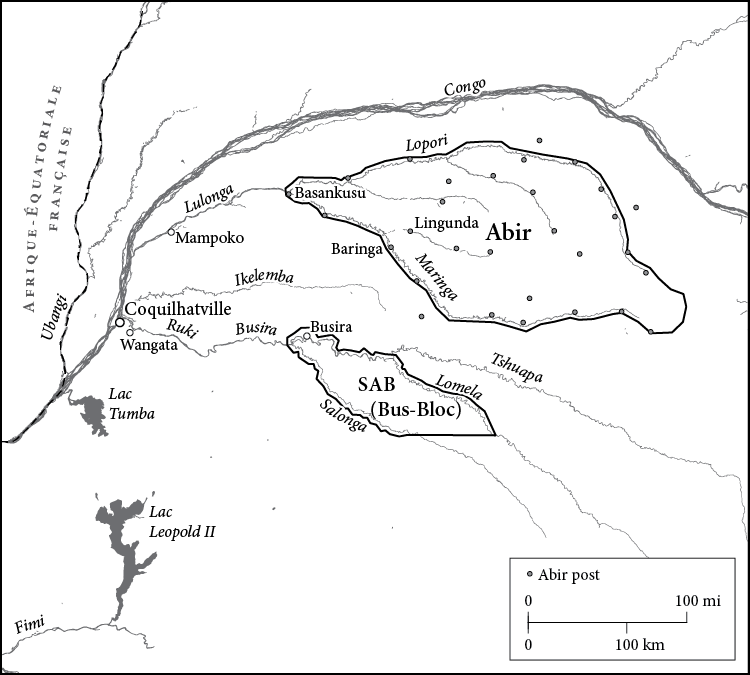
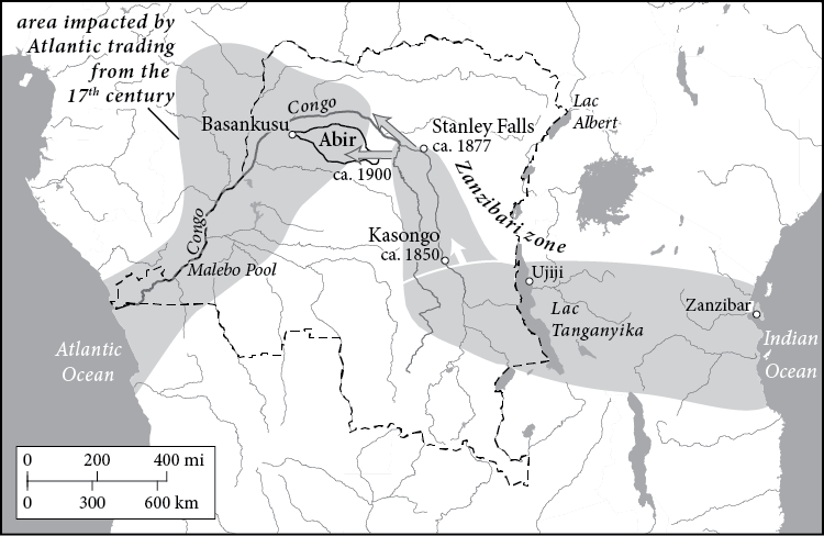
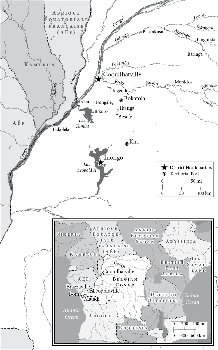
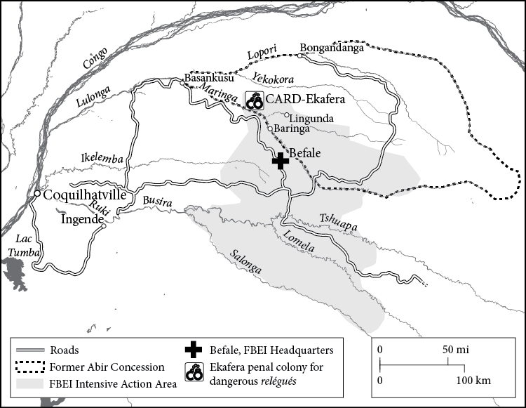
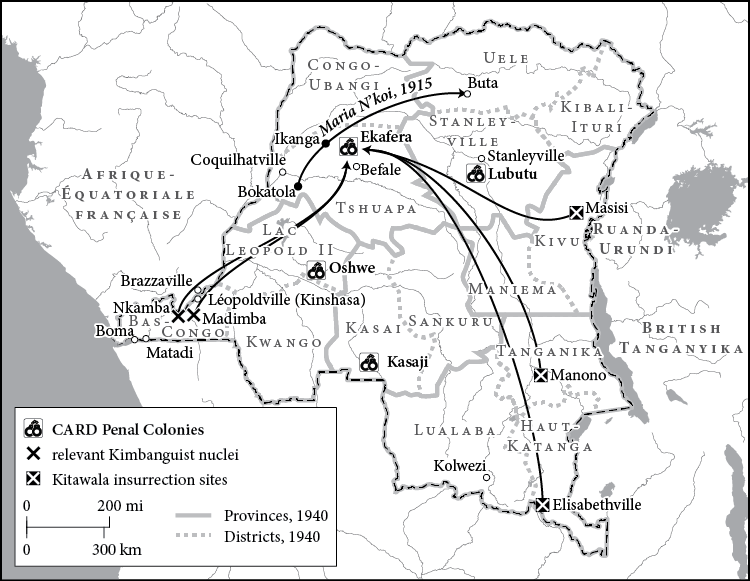
2014. Compiled using QGIS and designed with Adobe Illustrator/Avenza MAPublisher.
Duke University Press released A Nervous State by Univ. of Michigan Professor of History Nancy Rose Hunt in early 2015. We collaborated on six maps that attempt to distill complex social, political, and cultural forces across a deeply impactful period in the history of what is now the Democratic Republic of Congo. We begin by situating a particularly notorious Leopoldlian rubber concession along a tributary of the Congo River, and illustrate how this particular region lies at the confluence of foreign colonial aims, both by Europeans from the west, and Arabs from the east. Subsequently, we depict the boundaries drawn by European powers in central Africa by the early 1900s. We conclude with geographies of colonial incarceration and resistance. Six small maps that alone provide only a glimmer of a multi-faceted place and time—but in the context of the book, ground selected themes and provide a visual argument for why the locations of these forces matter—that the legacy of past injustices unfold spatially in new and sometimes tragic, sometimes hopeful events.
As always with maps produced for the Press, visual design economy is paramount: no color, and a palette of percent black that permits the legibility of text elements. The more elements or themes added to the map, the more those elements begin to compete for limited resources. I use the text haloing properties afforded by MAPublisher to provide a little more space to symbolize a broader range of qualitative information, whether the theme is colonial land holdings, change over time, or the extents of various activities across the landscape. Still not perfect in the execution, but I find the compilation of historically-relevant and period-appropriate geographic information, much of it digitized from historic maps I georeferenced in QGIS, to be particularly strong. To map is to research, and discover. My thanks to Dr. Hunt's assistant, Tristine Smart, for pulling together so many primary and secondary map sources for this project.
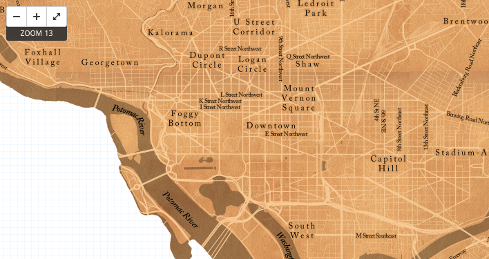
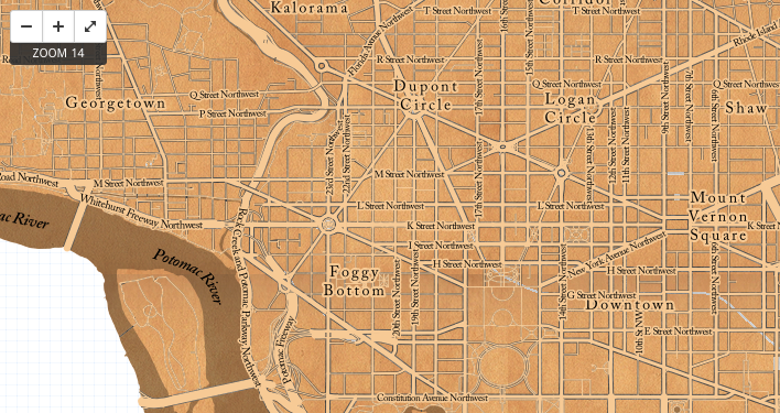
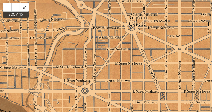
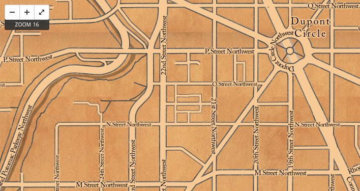
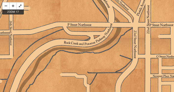
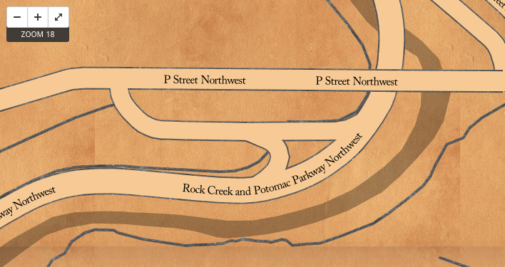
Historic Washington D.C.
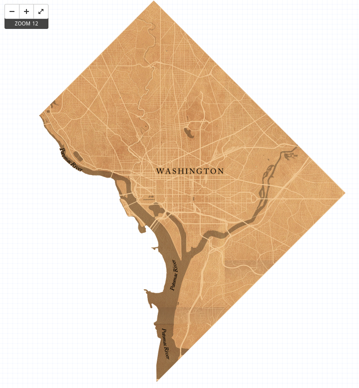
2014. Built using TileMill. Data from OpenStreetMap and the District of Columbia Data Portal compiled using QGIS. Scanned textures prepared using Photoshop.
This is a basemap I built in TileMill for a real-estate development analysis tool by Create, Inc. It takes inspiration from the early plans drawn for the city of Washington, D.C. in the late 1700s, particularly those by L'Enfant and Ellicott. I approach a historic look by taking advantage of TileMill's capabilities. An old paper texture is used as a polygon pattern fill. Dark lines, used for road cases and trails, are rendered using pencil lines which I have scanned and prepared for use in TileMill using Photoshop. Rendering water polygons over the paper texture in black with a 30% opacity value applied provides an appealing ink-wash look.
Throughout the design, elements are styled to enhance legibility at each zoom level.
Watering the Revolution by Mikael Wolfe
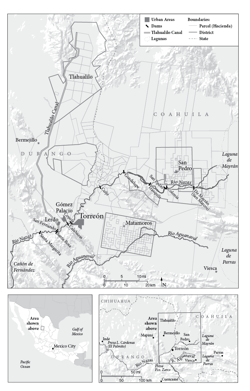
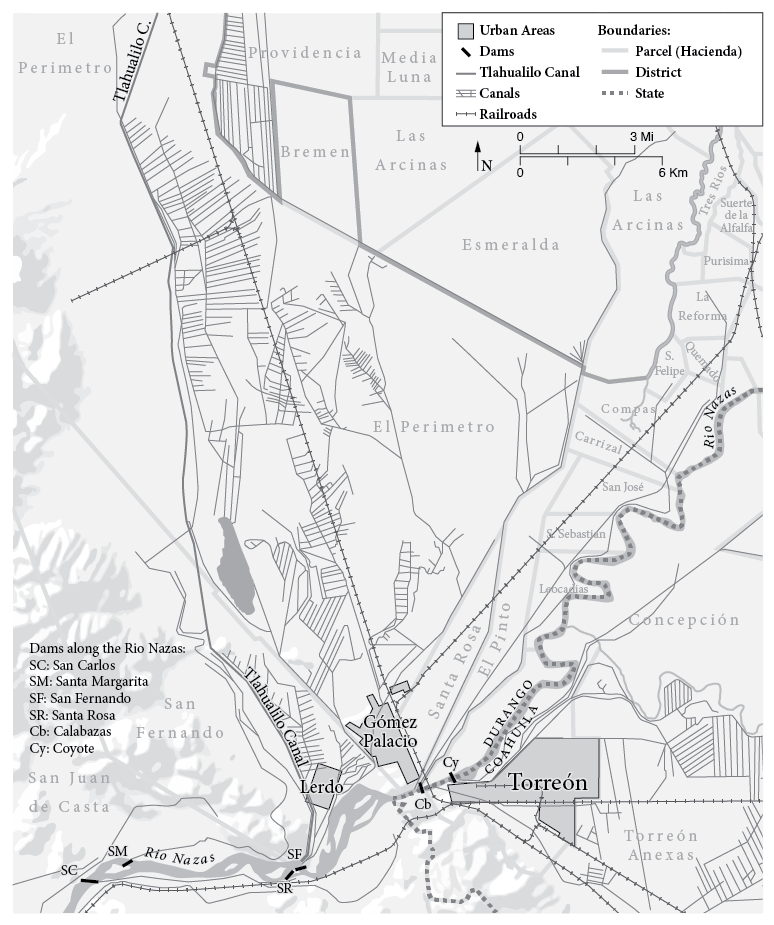
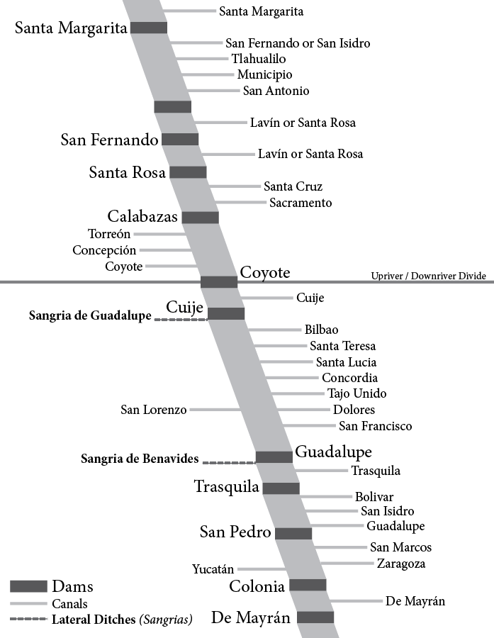
2013. Adobe Illustrator artwork. Data compiled and digitized from a historic map source in ArcGIS Desktop.
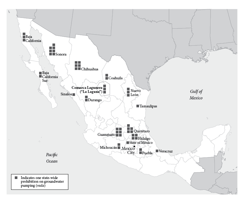
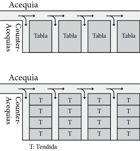
Duke University Press published Watering the Revolution, by Dr Mikael Wolfe, in 2017. Be sure to visit the link for an official description of the book. I completed most of the work on several maps and diagrams in 2013, with a handful of small revisions performed in 2016 as the publishing process neared completion. The maps provide a view of a spatially complex region comprised of land parcels, water infrastructure, and transportation facilities. The depictions in the main maps are built primarily from a historic map of the Laguna region, "Plano de la Comarca Algodonera de la Laguna en los estados Durango y Coahuila, Región del Rio Nazas" by a hydrologic engineer named Frederico Wulff, compiled in 1914. I georeferenced this map in ArcGIS Desktop and digitized the many parcels and related features prior to exporting the artwork to Adobe Illustrator. As the project progressed, Dr. Wolfe requested a small-scale map of groundwater pumping bans (vedas) in Mexico and a couple of diagrams illustrating various aspects of the region's irrigation system.
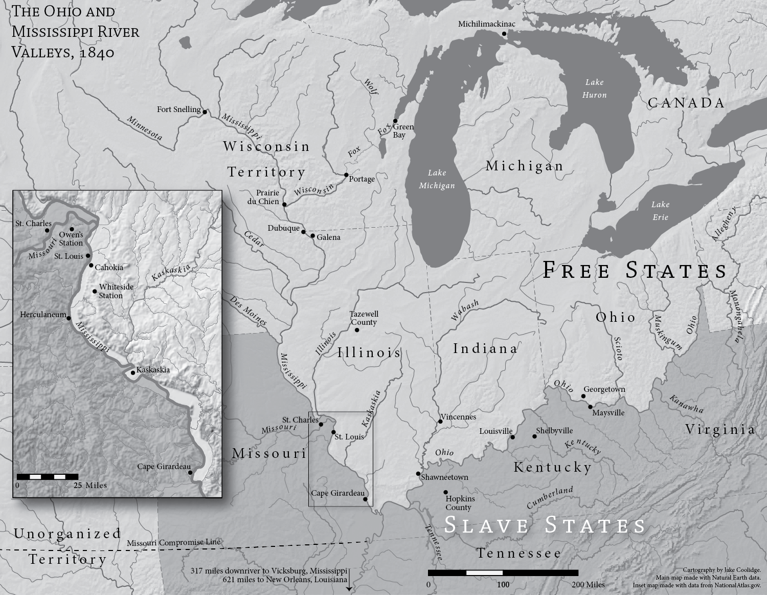
Redemption Songs by Lea VanderVelde
2013. Adobe Illustrator/Avenza MAPublisher artwork, compiled using QGIS.
Lea VanderVelde commissioned this map for her book Redemption Songs, published by the Oxford University Press. Click here to visit OUP's page for the book, which includes information on purchasing a copy. Lea is particularly interested in how rivers facilitated movement in this region during the Antebellum period, and she wanted a map that would indicate for readers specific places mentioned in the book and the rivers and waterways that linked them. The sharp delineations of state boundaries indicate the territorial reach of different laws enacted in the North and the South, but this is merely a backdrop for the lived experiences of persons of color navigating this frontier world at the time—a world, VanderVelde explains, that was much more complex and fraught with hardship and legal ambiguity for persons of color, on both sides of Free/Slave state divide.
The main map was made using data from Natural Earth's 1:10,000,000 scale series. The inset map was made using data from The National Atlas 1:1,000,000 scale series; the course of the Mississippi River has been corrected to be historically accurate.