Accessible color redesigns
Conditions prior to project
Deuteranopia, the most common red/green color perception deficiency found amongst males, is simulated using the Color Oracle application in the following images.
Normal vision
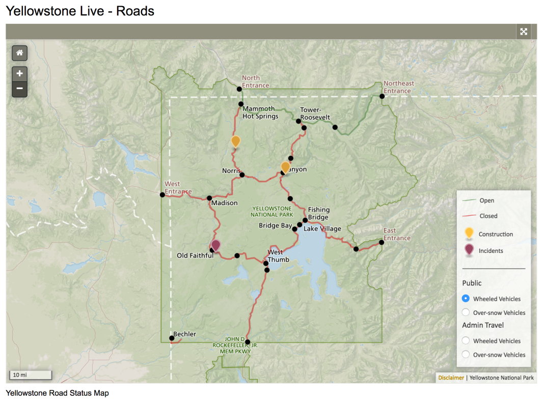
Deuteranopia

Normal vision
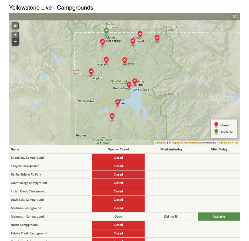
Deuteranopia
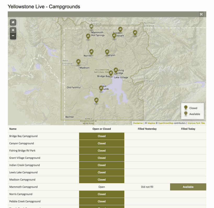
Normal vision

Deuteranopia

Normal vision

Deuteranopia

Design Strategies
The best color-blind-friendly designs use:
- Unambiguous colors
- Alternative visual variables
- Feature annotation
From B. Jenny and N. Vaughn Kelso,
"Color Design for the Color Vision Impaired",
Cartographic Perspectives no. 58, Fall 2007.
Additionally
We aim to use consistent colors for "open" and "closed" across Yellowstone Live maps and wall monitor displays.
First pass: color options
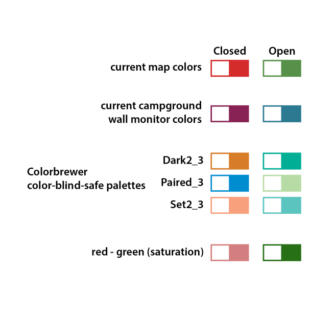
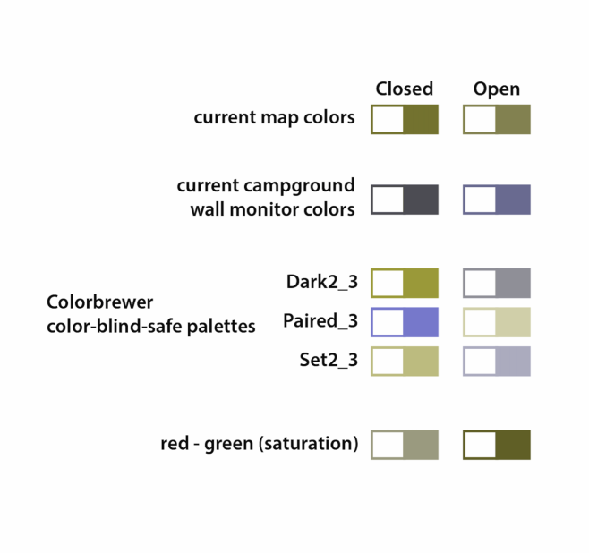
Colors used in this study
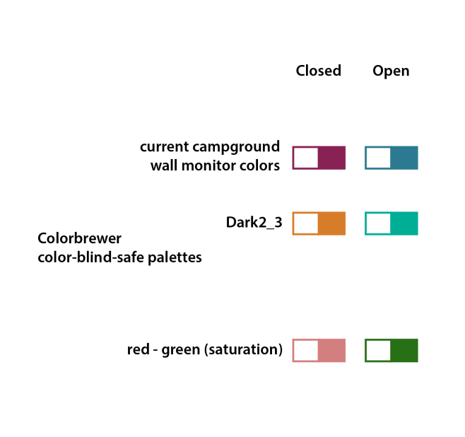
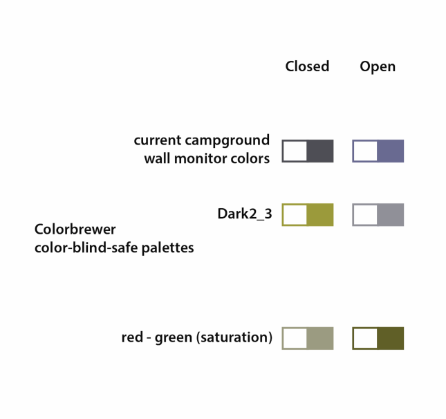
Purple/blue scheme
Matches a scheme initially used for campground wall monitors

Purple/blue scheme
Deuteranopia simulated

Color Brewer Dark2_3
Color-blind safe
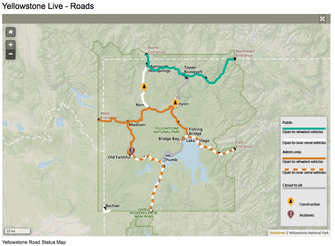
Color Brewer Dark2_3
Deuteranopia simulated

Red/green scheme
Uses saturation as a visual variable
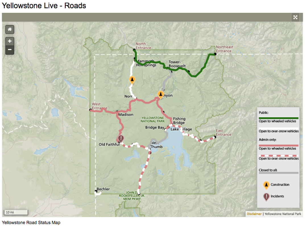
Red/green scheme
Deuteranopia simulated

Red/green scheme
applied to the campground map

Red/green scheme
Deuteranopia simulated
Uses both color and pictographic symbol to reinforce categories
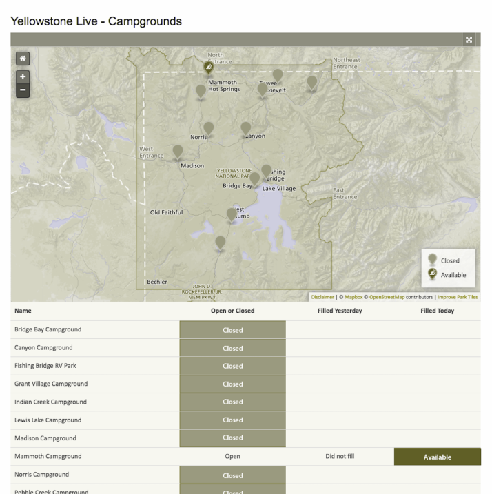
Red/green scheme
With thinner line symbols

Red/green scheme
Deuteranopia simulated

Subsequent variation based on feedback
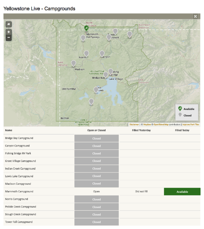
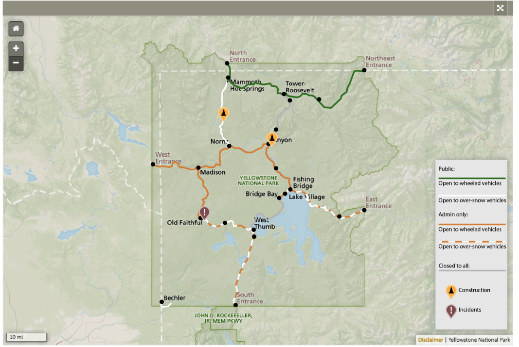
Park staff favored a hybrid color scheme comprised of the dark green from the red/green scheme and the orange from the ColorBrewer Dark2_3 scheme. The orange is stronger, visually, than the desaturated red (pink) and doesn't convey "closed" as much as "different from public usage". Gray is favored to indicate closed, and the thinner line weight is preferred.
Hybrid scheme
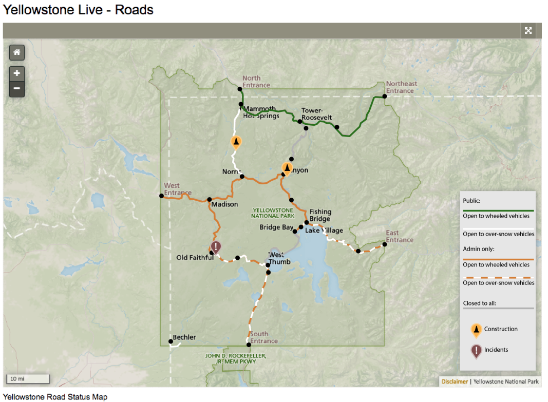
Hybrid scheme
Deuteranopia simulated

Campground and lodging maps adjusted to match hybrid scheme
